Scalix Insights3 min read
How UX Thinking Shaped A Chemical Manufacturer’s Digital Presence
By Prafful Suthar
How UX Thinking Shaped A Chemical Manufacturer’s Digital Presence

UX redesign transformed a chemical manufacturing website into a user-centric digital platform improving content clarity, usability, and trust. The redesign drove an increase in quote request conversions, enabled 40% faster information discovery, and cut product related support calls by 63%.
Problem Statement
Despite being a well established, research driven chemical manufacturer with deep expertise in fluorine-based pharmaceutical intermediates and advanced technical capabilities, its digital experience failed to reflect the company’s scale, credibility, and expertise. Dense content, outdated UI patterns, weak visual hierarchy, and unclear user journeys made it difficult for users to navigate the site, quickly understand offerings, or locate critical information. As a result, user engagement suffered, decision-making timelines were extended, and valuable opportunities to convert interested visitors into qualified inquiries and business leads were consistently missed.
User Story
_Persona
_Procurement Manager at a pharmaceutical company
_Frustration
_The website presents dense, text heavy content where critical information about product capabilities, certifications, and manufacturing standards is difficult to scan or locate. Important compliance details are buried deep within pages, the visual design feels outdated and there is no clear guidance on next steps making partner evaluation slow and uncertain.
_Desired Outcome
_I want to quickly understand product capabilities, certifications, and manufacturing standards through a clear, well structured experience so that I can confidently shortlist reliable partners without spending hours navigating unclear or overwhelming pages.
Solution
_Design Approach
_Implemented a user centered redesign methodology structured around four phases: Discover, Define, Design, and Deliver. Rather than applying superficial visual updates, I reconstructed the information architecture from the ground up based on actual user workflows identified through research.
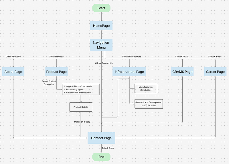
User Flow
Key Improvements:
-
Intent based entry points from the homepage
-
Simplified navigation with logical content grouping
-
Clear pathways to product details and contact actions
-
Reduced number of steps to reach high value information
Color Palette:
The color system balances trust and clarity, using a stable blue foundation, warm accents for key actions, and high-contrast text to support fast, confident decision-making.
-
Primary: Burnt Orange (#F16136) — innovation and precision
-
Secondary: Deep Navy Blue (#0D4064) — trust and professionalism
-
Tertiary: Warm Gold (#7A2A2B) — premium quality indication
-
Neutrals: Soft grays with high contrast ratios (WCAG AA compliant)
Typography
A clear typographic hierarchy balances confident headings with readable body text, making complex information easy to scan and understand.
-
Headings: Padauk (clean, modern, excellent readability at all sizes)
-
Body: Inter (optimized for technical content)
Tools & Technology Used
-
Figma: Primary design tool for low-fidelity designs (wireframes) and high-fidelity designs (prototyping)
-
Figjam: Collaborative user journey mapping and user flows
-
Adobe XD: Custom iconography
-
AI Tools: Lovable, Visily, Claude, ChatGPT
Results
Quantified Outcomes
-
40% faster content discovery during usability testing
-
Reduced bounce rate due to improved first screen clarity
-
Clearer conversion paths, improving inquiry intent
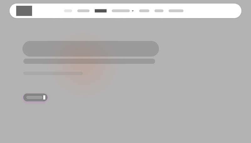
Low-Fedility Design (Hero Section)
High-Fedility Design (Hero Section)
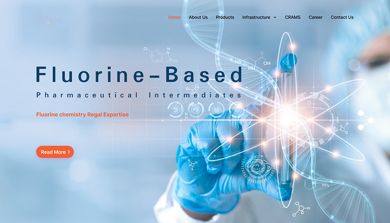
Before/After Visual Comparison
HomePage Evaluation
Before:
-
Lower visual engagement due to passive hero experience
-
No CTA available
-
Logo positioning unclear
-
Navigation items: 5 links, basic structure
-
Zero animation or movement
After:
-
Motion driven visuals increase user attention
-
CTA stands out clearly, guiding users toward deeper exploration
-
Refreshed logo with brighter colors
-
More professional navigation structure
-
Subtle animations throughout the page with hover interaction
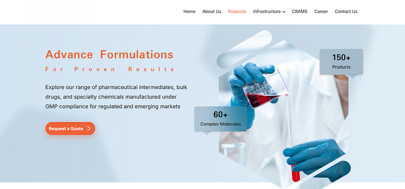
Product Page Evolution
Before:
-
Product Menu — 4 categories, unclear
-
Product listing with outdated specifications, image and in tabular format
-
Quote request required phone call
After:
-
Product Menu — 3 relevant categories
-
Structured listing with search filter
-
One-click quote request
Old Design of Product Page (Hero Section)

Re-designed Product Page (Hero Section)
Conclusion
By aligning user intent with structured content and thoughtful UI, the redesigned website now delivers clarity, credibility, and measurable business impact.
📞 Let’s Connect
If clarity is your next competitive advantage, let’s design for it. Scalix.in
Tags: #UXCaseStudy #UXDesignProcess #EnterpriseUX #WebsiteRedesign
About the author
Prafful Suthar writes for Scalix on enterprise platforms, high-throughput systems, and ERP delivery. Scalix builds and migrates mission-critical software for regulated and scale-heavy organizations from Mumbai and remote-first teams. See our case studies for problem–solution–result write-ups, or contact us about your roadmap.